Redesigning journalism for the social age.
The News Movement
The News Movement is a social-first newsroom created for a generation that encounters news incidentally rather than intentionally. Founded to serve audiences who care about what’s happening in the world but no longer engage with traditional news formats, TNM sits at the intersection of journalism, culture and platform behaviour.
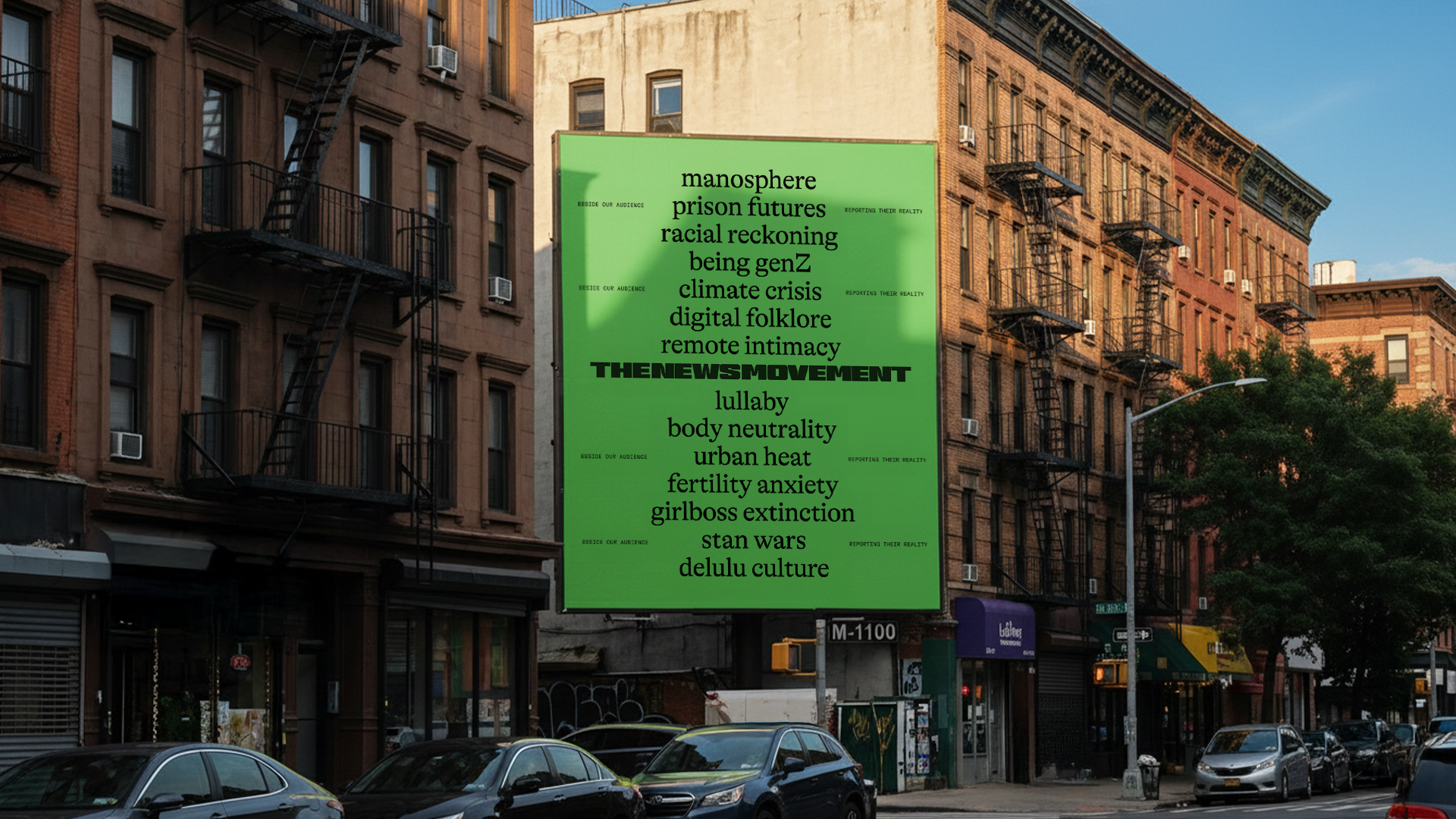
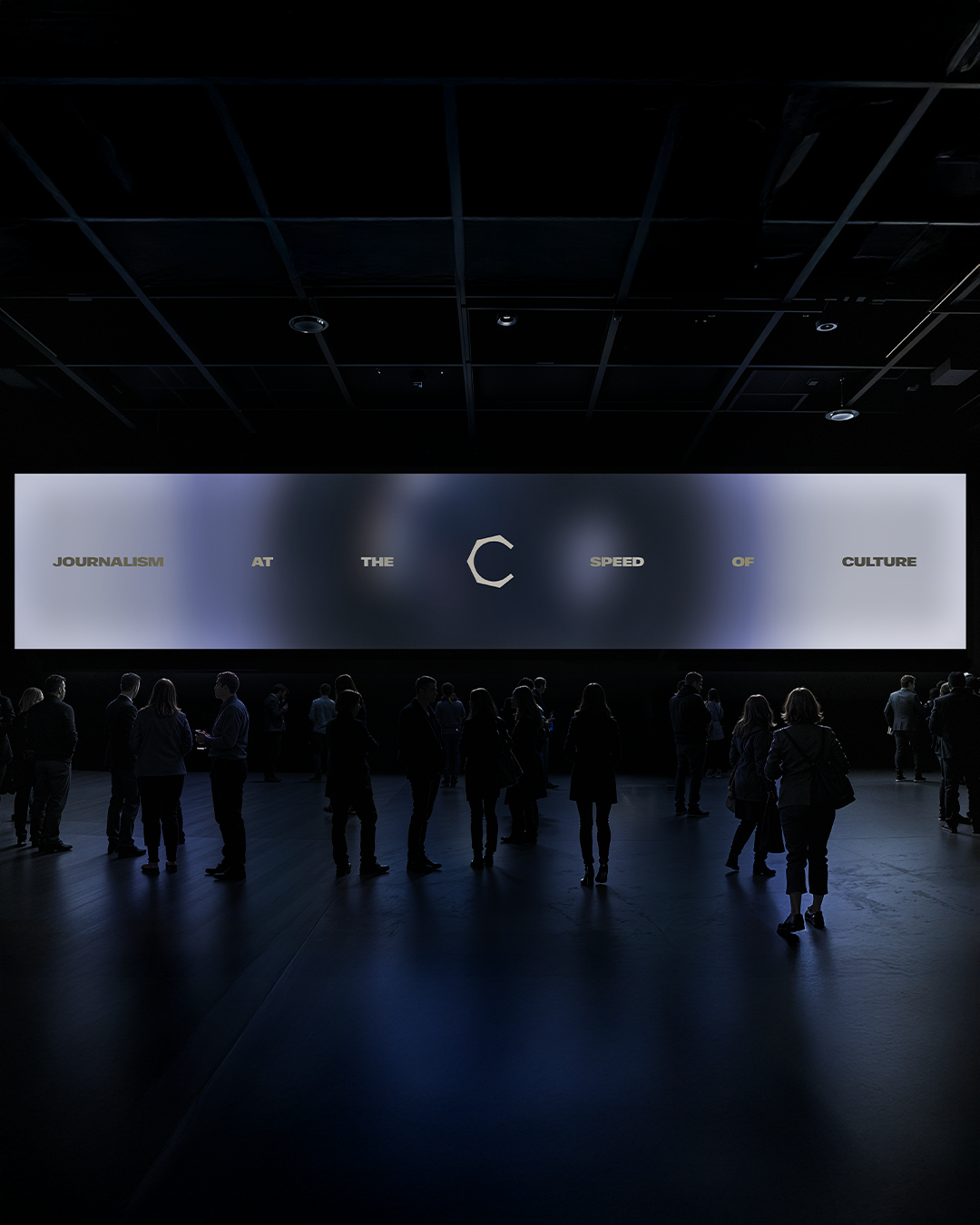
We developed a brand strategy grounded in a single principle, beside our audience, reporting their reality. Rather than replicating the authority of legacy media, the identity positions TNM as a companion, credible and grounded, and fluent in the visual language of social spaces.
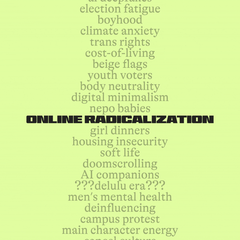
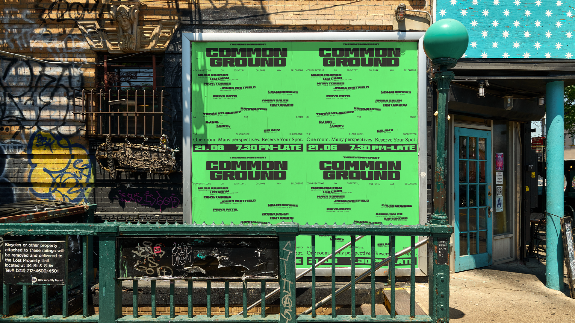
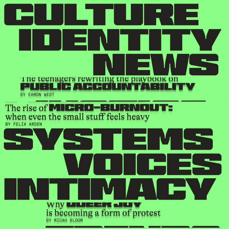
The visual system is built on juxtaposition. Instead of relying on a single aesthetic, the identity brings distinct elements together in unexpected ways to reflect the complexity of contemporary news. Type, imagery and layout are deliberately set in tension, allowing contrast to create a cohesive yet adaptable language. This approach gives The News Movement a recognisable tone while remaining flexible enough to respond to the pace and variety of social feeds.
Typography anchors the system and drives the layout language. Three juxtaposing typefaces work together within a flexible hierarchy that shifts depending on the story being told. Differences in scale, weight and placement introduce friction where needed, allowing tone and emphasis to reflect the content rather than forcing uniformity. The layouts are simple enough for journalists to use quickly for real-time reporting, yet rich enough to carry nuance. Clear rules, easy hierarchy and platform-native framing ensure the system is fast to work with and serious in tone, while remaining distinctly The News Movement.
Colour plays a supporting but essential role. We refreshed The News Movement’s existing green to feel more vibrant, fresh and confident, while retaining its recognisability. A supporting palette of greens, yellows and purples adds range and dimensionality, giving the system flexibility across stories and platforms while allowing green to remain the primary anchor.
Designed to operate at newsroom speed, the identity includes a suite of simple, repeatable templates that enable journalists to publish quickly without sacrificing credibility. The result is a brand that moves at the rhythm of social while maintaining the backbone of journalism, fast to make, serious in tone and built for trust.
Read more
Read less

Thank you
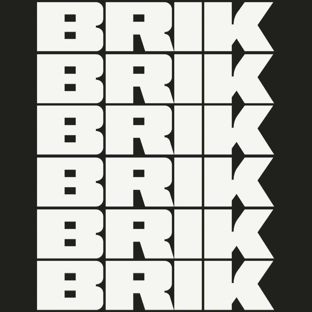
Typography is central to The News Movement’s identity. With thanks to The Designers Foundry for Brik, and Grilli Type for Alpina and GT America Mono, whose typefaces underpin the system’s clarity, contrast and editorial confidence.
Relevant Projects


.svg)